5 Content Accessibility Issues and How to Fix Them
For many web teams — regardless of the industry — site accessibility remains a reactive issue. Too often, the drive to adjust site content to make it more accessible comes on the heels of ADA (Americans with Disabilities Act) complaints filed against the organization.
While that approach does ensure that the web continues to evolve toward a more accessible space for all users, it also ensures that process will be a slow, uphill battle for both users and content creators.
The ideal approach is to evaluate and adjust your own content proactively.
While some issues require fairly extensive development and design changes to resolve, there are plenty of content issues that can be addressed directly by the content team without the need to involve development or design resources.
Add Alt Text to All Images

While many site users are able to view and decipher images without issue, users who rely on screen readers — as well as those whose devices or browsers don’t support images — must rely on alternative text.
All modern content management systems support alt text, and every image on your site should contain alt text that provides both a description of the image and any relevant context for the image. For example, the alt text for the above image describes the content of the photo (a blond, clean-shaven man), but it also provides context by calling out that the image is of Eric Grzymkowski, the Marketing Manager.
If your site is relatively small, the best way to ensure that all of your alt text is both present and optimized is to methodically review each and every image on your site. However, for large sites that contain thousands of different images, the process of reviewing each image one by one might not be possible. Luckily there are a number of free tools available to expedite this process. For example, the lite version of the Screaming Frog SEO Spider will crawl up to 500 URLs and help you isolate which images are missing alt text.
Include Closed Captions for Video Content

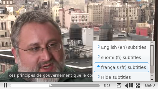
Video content can add a great deal of depth and immersion to your site, but if your videos don’t contain closed captions, the impact of that content is severely diminished for anyone who is unable to hear the audio. It’s also important to note that this doesn’t just apply to users with hearing disabilities. Closed captions are incredibly beneficial to users in loud spaces, users in quiet spaces who don’t want to disturb those around them, users who do not speak the language presented in the video, or for instances where the audio may be otherwise difficult to decipher.
Just like with alt text, the ideal approach is to manually audit and create customized closed caption files for each and every video on your site. However, there are a number of transcription services available that can create closed caption files automatically. For many videos, Youtube’s automatic captioning software can produce relatively accurate closed caption files.
Transition Away from PDFs
For quite some time, PDFs served as a quick and easy way to make content available to users that was difficult to replicate directly on a page. Creating a link to download a PDF could be done in a matter of minutes, whereas designing and developing a page to house that content could take hours or even days.
Unfortunately, PDFs offer very little when it comes to accessibility. Depending on how the PDF is configured, many screen readers struggle to read PDF content at all. Which leaves many users completely unable to access whatever content that resides within them.
If you don’t have the time and resources to completely overhaul all of your PDF content and convert it into pages on your site, another option is to start gradually updating your PDF content to ensure it is as accessible as possible. The University of Washington provides a helpful guide for using Adobe Acrobat Pro to both evaluate and improve the PDFs on your site.
Improve the Readibility of Written Content
Readability is an often overlooked accessibility issue, but it’s one that is fairly easy to evaluate and improve on your site.
For most content creators, text is the primary method used to tell stories on their site. But in many cases the messages may not be optimized for the audience.
According to the Clear Language Group, the average American Adult reads between a 7th or 8th grade level. It is critical that the language on your site be clear, concise, and avoid using words that would be unfamiliar to the average user.
To ensure your written content is accessible, we recommend using a tool like the Hemingway App. The free tool will provide you with an overall grade level for text, and highlight specific areas that might be confusing or that could be rewritten using simpler language.
Use Consistent Heading Structure
If you’ve ever used a WYSIWYG tool, then you’ve had some exposure to heading options and how they change the appearance of text on a site.
What you might now realize, is that they also create a unique structure and flow for users on your site. And if the structure you’re creating is inconsistent, you risk tripping up all of the users on your site — particularly those utilizing screen reader technologies.
The ideal header structure is sequential, and presents content in an easy-to-follow hierarchy.
Your Main Heading Should Be an <H1>
With Sub Heads Like This <H2>
and This <H2>
You Can Even Have Sub Sub Heads Like This <H3>
But You Shouldn’t Skip Sub Heads and Move Straight to an <H5> Like This
Once you start thinking of your heading structure as map for the content — instead of a means to make a particular line of text appear a certain way on the page — you should be able to quickly resolve any existing discrepancies on your site and ensure that future content remains accessible.