7 Best Capital Campaign Websites for Universities and Colleges
Find out what makes the best university or college capital campaign website with capital campaign examples from top higher education websites.
As more colleges and universities launch comprehensive fundraising campaigns, the stand alone website has become a critical communications tool and and integral part of the campaign process. Gone are the days when a few pages on an existing website would suffice. As campaigns become more complex and draw a wider group of donors, universities must put appropriate strategic effort into online campaign communications.
Planning Your Capital Campaign Website
How donors interact with and use a capital campaign website changes over time. We’ve identified three key phases for the typical capital or comprehensive campaign. Your website should be designed to be a primary communication tool in each phase (see the campaign site examples below to see these ideas realized):
Phase 1: Launch and Inspire
The first use case for the website is to launch the campaign with a splash and inspire the community. It is important for the site to set the vision for the campaign and connect emotionally with donors. This connection is best achieved through campaign videos and stunning, evocative photography. The most successful capital campaign websites merge large, immersive images with sharp copywriting to draw donors in and inspire them. The websites from American, Wittenberg, Brown (see below) offer some terrific examples of inspirational videos. Check them all out, as each video takes a different storytelling perspective.
Phase 2: Evaluate and Give
As the campaign evolves, the campaign website must provide depth and specificity for each giving priority so potential donors may explore, compare, evaluate, and learn about various funding opportunities. Donors must be able to see how their donation will impact the school. But specificity in giving is no longer the sole purview of leadership donors. With the advent of crowdfunding, more participation-level donors seek to direct their gifts to specific initiatives that are personally meaningful. This need requires content that — in a friendly and inspiring way — details the specific initiatives. UC Davis, Wittenberg, and Dartmouth all succeed in this effort.
The campaign site should also illustrate the outcomes and personal impact of donor support. Through our work with alumni and donors, we found that donor profiles for high value gifts are helpful in reaching new donors and providing recognition. And for the smaller donations, the capital campaign site must provide clear pathways for giving. Sites should streamline the giving form to make online giving simple and straightforward. For great examples, check out the UT Austin and American University campaign sites.
Phase 3: Inform and Document
Finally, the site needs to capture the activity and milestones in the campaign. This includes donor recognition, achievement of key milestones, campaign events, and current impact stories.
Example Capital Campaign Websites for Universities
Let’s look at some capital campaign website examples. These recent websites highlight the key features required for a successful site: bold design, inspiring video, crisp writing, and easy donation processes.
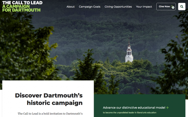
Dartmouth College – The Call to Lead

Dartmouth College's Call to Lead campaign offers potential donors the unique opportunity to choose exactly how their donation will impact the global Dartmouth community. The site features hundreds of initiatives with distinct fundraising goals, all with detailed descriptions that showcase the importance of each and every project. For potential donors that might be overwhelmed with the sheer volume of ways to contribute, the site includes a helpful widget that allows them to narrow down their options based on interest.
Noted for: Offering an incredible wealth of donation options, and providing potential donors with a clear understanding of how their contributions will be utilized.
University of Texas Austin – What Starts Here

This site starts off strong with an atmospheric video that feels bold and heroic. The homepage continues with a brief but powerful case for supporting the campaign. One common challenge with comprehensive campaigns is that participation-level donors may be confused about the campaign’s purpose and the relevance of non-leadership gifts. This site does an excellent job of educating the donors about its purpose and their impact by answering questions such as “How will my gift be used?” and “What does a state university need a fundraising campaign?” The site also enables schools and units to each articulate their own priorities and offer donors ways to support the specific causes that matter to them.
Noted for: Donor education and transparency
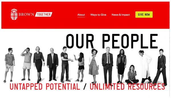
Brown University – Brown Together

While we liked this site for its bold vision and graphics, we especially liked it for the design of the people page and minimalist design of the icons. The campaign video stands out from other videos for its specific focus on the student experience at Brown.
Noted for: Bold, fresh design elements
Wittenberg University - Having Light

We like the fresh, warm visual design that conveys a feeling of light, in alignment with the campaign theme. This site also features a broad array of alumni through its Witt Stories, conveying a strong sense of the community behind the campaign. They serve as powerful testimonials for the university’s long-term impact as well as social proof for broad campaign participation.
Noted for: Strong brand execution and community engagement
American University - Change Can’t Wait

This campaign site provides clear and detailed information for how they intend to execute on each of the three campaign pillars. It also provides both quantitative and qualitative evidence of each pillar’s impact through progress bars and effective storytelling. The inspiring video conveys a sense of urgency in line with the campaign theme. This site also offers a sleek giving form that minimizes required information while giving the donor the opportunity to provide more direction if they so desire.
Noted for: Clearly defined priorities demonstrating qualitative and quantitative impact
UC Davis - Expect Greater. From UC Davis. For the World.

This site stands out for its colorful, energetic visual design with thoughtful use of animation. It makes a comprehensive case statement with clear priorities and progress for each college, school, and unit. Unusually, its “Ways to Give” page is framed around audiences rather than tactics. Overall, the focus on prospective donors and what matters to them encourages broad support for this comprehensive campaign.
Noted for: Comprehensive giving opportunities and creative visual design
University of Rhode Island - Big Ideas. Bold Plans. The Campaign for URI

The site has a deep archive of the feature stories that showcases the excellent research and student impact happening at the university. Every story is connected to one or more pillars. Pillar pages clearly articulate the impact and value of each set of goals and make the case through statistics, testimonials, and powerful storytelling.
Noted for: Strong editorial content aligned to campaign pillars
Planning for Your Comprehensive Capital Campaign Website
On average, campaign websites take between four and nine months to complete depending on the inputs. Planning for visual content like video and photography is the most time-consuming portion of the project. Before you get going, consider these five key questions:
- What are the goals of your capital campaign website, and how will you measure them?
- Are you building a giving site or a case statement?
- Who will create ongoing content for the capital campaign?
- How will you recognize donors and track progress?
- How will you handle social media?
Get our insights on preparing and planning for capital campaign websites or find out how we can work together on yours.