Business School Websites You'll Want to Emulate
Learn why these business school sites stand out and what makes them so effective.
Your business school’s website is critical step in the prospective student journey, and the needs of those prospects create unique challenges to marketing teams looking to influence them. For example, business school students tend to be outcome-oriented and highly focused on schools’ rankings, career services, and alumni networks — site elements like large imagery featuring dining and housing might not be as compelling for them as it might be to other prospective students.
We've pulled from our own extensive research with prospective students and work we've done with other business schools to identify 12 business school websites that each employ a unique design approach, content strategy, or site element that we feel is worth emulating for anyone considering a major redesign or iterative update to an existing business school site.
Harvard Business School
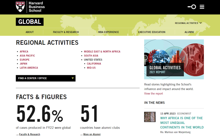
In today’s interconnected world, many prospective business school students prioritize opportunities to learn to work and lead internationally. Harvard Business School’s site does an excellent job positioning the university as a truly global institution, highlighting facts and figures about the school’s research, alumni, and impact around the world. The site breaks out data in several different ways — including by region — so prospective students can easily find content related to their specific area of interest.
Best For: Establishing international prominence
Rice University, Jones Graduate School of Business
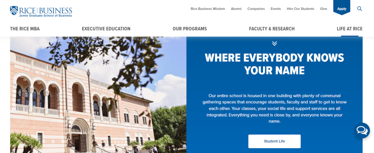
For many students, business school isn’t just a time to learn, but a chance to develop a lifelong network. Rice’s site offers a comprehensive look at campus culture through its “Life at Rice” section, which includes information about student organizations, opportunities to intern and work for Houston-based corporations, and “day in the life” videos to help prospective students imagine their futures. The page also highlights the school’s podcast, which shares the personal stories of students, faculty, and alumni.
Best For: Highlighting campus culture
Miami Herbert Business School

For business schools that offer both undergraduate and graduate programs, speaking to both groups of potential students can be a challenge, given their unique priorities and perspectives. Miami Herbert Business School homepage offers a concise overview of undergraduate and graduate options, as well as programs for executive education and doctoral prospects.
The site also offers a wealth of student stories and allows visitors to quickly view quick metrics from a list of filters including diversity, sustainability, rankings, and business technology.
Best For: Catering to a variety of prospects
Northwestern University, Kellogg School of Business
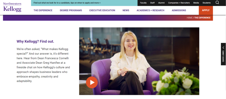
Business school sites need to cater to prospective students, current students, and alumni — and those groups differ a great deal in their needs. Prospective students who lack previous knowledge of a school, for example, can benefit from additional context and navigational cues. Offering a clear path through the site encourages these viewers to engage with more content and build a better understanding of the school. Kellogg uses a link directly beneath the header to draw first-time site visitors to an introductory page that offers high-level information about the school’s mission, program offerings, and outcomes.
Best For: Providing clear paths for different audiences
Auburn University, Rayburn J. Harbert College of Business

For schools that offer many different programs, like Auburn University’s business school, it can be difficult to present all the relevant information to prospective students without overwhelming them. Auburn handles this difficulty well by offering a simple, straightforward homepage navigation that guides viewers through the school’s different undergraduate, graduate, and certificate program offerings. By skipping embellishments, they avoid overwhelming site visitors who already have a lot of information to take in.
Best For: Simple, effective site navigation
MIT Sloan School of Management

Faculty research and expertise is a major differentiator for top business schools, and MIT’s Sloan School of Management site makes the most of its top-tier professors. The site’s engaging, searchable “Ideas Made to Matter'' section combines stories on faculty research, opinion pieces, and actionable advice for leaders. Framed as inspiration for global business leaders, this content also demonstrates the MIT faculty’s thought leadership to prospective students.
Best For: Highlighting faculty
University of Chicago, Booth School of Business

Most business school websites include a diversity, equity, and inclusion statement, and many include information about student demographics. However, these statements often aren’t backed up by specifics. The University of Chicago offers an excellent model to follow, with a page on its diversity efforts that pairs clear values with concrete action items. The page breaks out the key elements of its DEI efforts and details specific partnerships and efforts within the university, in Chicago, and beyond. It also highlights stories of diverse alumni, students, and faculty who are making a positive impact in their communities.
Best For: Focus on DEI
Hult International Business School

Most business schools are part of a larger university, which means that their website needs to blend cohesively with the school’s overarching brand strategy. Hult International Business School, however, is a standalone, relatively new business school, and its site leans into that unique status with an aesthetically pleasing approach that stands out from the competition. Stylized, colorful illustrations evoke the school’s numerous international locations and emphasize the school’s modern approach. Business schools within universities may not have the same level of creative freedom as Hult, but focusing on modern, high-quality design will always pay off.
Best For: Compelling design aesthetic
Georgia Tech, Scheller School of Business

There’s no single prescribed pathway to attending a business school — but students from a variety of backgrounds might nevertheless worry that they won’t belong. Georgia Tech’s “Humans of Scheller” feature assuages that concern by showcasing students who come from a range of backgrounds and are enrolled in different types of MBA programs. These detail-rich student profiles can help website visitors picture their own paths to a graduate business degree.
Best For: Detailed student profiles
Duke University, Fuqua School of Business
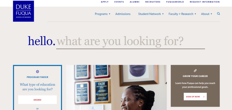
Even the best navigation can’t get every site visitor to what they need in one or two clicks — and many prospective business school students have highly specific queries.
Though Duke’s Fuqua School of Business site offers a robust homepage navigation, it also places a high-quality search function with drop-down results front and center on its homepage. The homepage also features a “program finder” feature, which navigates the viewer through a few quick questions to guide them to specific degree options that fit their needs.
Best For: High-quality search tool
Georgetown University, McDonough School of Business
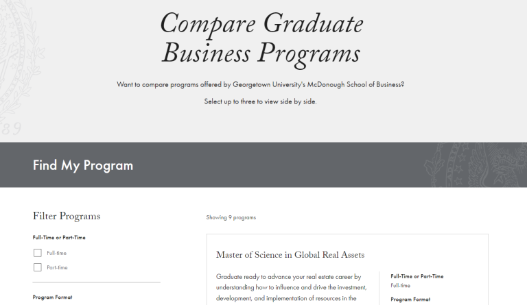
There’s more to business schools than MBA programs, but prospective students may not know how to search for highly specialized graduate business programs.
Georgetown University’s business school site addresses this challenge by offering a program finder feature that allows students to compare degree programs based on criteria like length, expected years of work experience, program format, and more. This is a clever way to drive traffic to programs like the school’s “Master of Science in Global Real Assets,” which are unlikely to receive nearly as much organic traffic as more well-known degree programs, like MBAs.
Best For: Comparative program finder tool
Yale School of Management

Business degrees are often industry-agnostic, and many business school sites keep their content fairly general to appeal to potential students no matter their career goals. However, this approach means that schools often miss the opportunity to engage with students who know what they want to learn.
Yale addresses this challenge by offering filtered content targeted toward specific interests and career paths. These features include industry overviews, explanations of how Yale’s curriculum relates to each career, and quotes from alumni working in those fields, making abstract degree programs more concrete and relatable on an individual level.
Best For: Content filtering