Designing Effective Online Doctor Finder Tools for Hospitals, Healthcare and Insurance Websites
Thinking about building a "find-a-doctor" tool for your healthcare website? Here's what you need to know first.
For healthcare organizations and insurers looking to attract new customers, using their website to engage with potential customers is critical. A key piece of information potential customers want to see on the website is the doctor search, as it helps them determine if their doctor is available or lets them discover the types of specialists covered.
User Research Task: Find a Doctor
We conducted moderated user research testing of four different doctor search tools in order to understand the key features and behaviors of users searching for doctors. Using various “find-a-doctor” tools, we asked participants to search for a gender-specific doctor in internal medicine near them who also speaks a specified language.
Online Doctor Finder Feature Set
When confronted with a “find-a-doctor” tool, participants wanted much more than a search box. All participants wanted a rich set of tools, including:
-
Complete set of filter facets before search so as to select speciality, location, etc.
-
Editable facets on the search results/listing page
-
Search a radius around a zip code
Of the four interfaces tested, the search tool from Kaiser Permanente scored “close to perfect” with users. They commented, “I found Kaiser Permanente to be easiest to use, and it provided a great deal of quality in-depth information.”

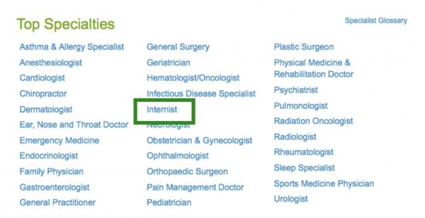
Users liked the order of the search fields and especially liked the zip code finder. Keeping additional features hidden under “more search options” is a smart choice as it keeps the user interface uncluttered. WebMD offers a different approach to the initial search screen. In addition to an open text search box, WebMD has an interface that allows users to “browse” by speciality.

Half of users opted for starting their “search” with this browsing interface before refining their results using the filters on the second screen.
On the Search Results Listing
After their initial search, users then attempted to refine their results to find the most relevant doctor. The content users prioritized on the search results included:
-
Exposed filters to further refine or change their search
-
Photos of doctors
-
Years of experience

The screenshot on the left from WebMD was the top ranked listing. It scored nearly perfectly, with the only criticism from users being a lack of doctor photos. On the right, the image from a New Hampshire hospital lacks detail in the individual listings and the filter set highlighted in the pink box at the top was too limited.
Doctor Search Results on a Map
Users were split on the display of doctor results on a map. Most users interacted first with the listing and then used the map.
Doctor Profile
On the search listing, users strongly preferred results that provided them with a rich profile.
-
Doctor name
-
Doctor photo
-
Years of experience
-
Office locations/address
-
Language fluency
-
Accepted insurance plans
3 Recommendations for Designing a Find a Doctor Tool
First, when designing a “find-a-doctor” search tool, prioritize and test the top search criteria and make them available on the first search. Second, provide a rich set of filters on the search results screen, including the ability to remove filters already set. There should never be a need for the user to have to use the back button or restart the search. Third, provide rich search results that include photos, years of experience, location, and insurance carriers. Detailed search results reduce the number of clicks and allow users to more easily compare doctors.