Digital March Madness: Road To the Final Four Websites
We're moving March Madness off the basketball court to online, matching up 64 teams in a head-to-head battle for website dominance. Find out who made the Final Four!
The Big Dance. March Madness. Bracketology Season. Whatever you call it, it’s the time of year when even the most casual sports fan fills out a bracket and the nation cheers for underdogs and upsets. But while most people pick NCAA College Basketball teams for their brackets, we put a different spin on this year’s tournament. Instead of pitting schools head-to-head on the court, we put them against each other online in an all-out battle for website domination. With our bracket all filled in, we meticulously selected our favorite websites from each of the four regions, and like every great March Madness tournament, we even have a Cinderella Story. So here they are: your Final Four websites.
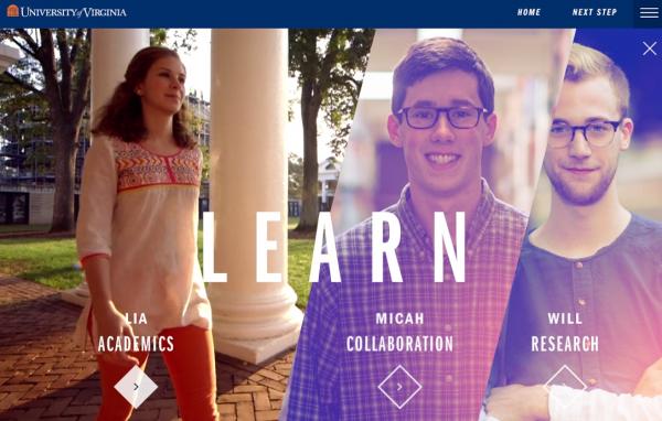
Midwest Regional: University of Virginia

Number one seeded University of Virginia came out our number one website in the Midwest Region. While there are many things we love about UVA’s website, top of the list is the stunning use of video. With sharp editorial focus and distinct style, these videos use current and former students to explain the UVA experience, covering everything from academic rigor and life on campus to affordability and outcomes. Hearing this information directly from students is critical to anyone seriously weighing the decision to apply or accept. The overall design of the site is also very styled. With rough edges and textured overlays, it has a fresh look and feel, clearly designed with the prospective undergraduate in mind. In addition, the site makes it very easy for prospective students to find content. Sections like “Start Here” and “Take the Next Step” guide students toward visiting campus or applying, while also articulating what makes the university unique.
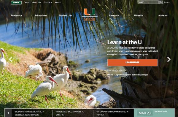
South Regional: University of Miami

The number three seed out of the South Regional (and still alive in the basketball tournament as of this writing) is University of Miami. Their website was a breath of fresh air — literally. The full-screen hero image of birds and a palm tree at the water’s edge makes site visitors dream of hitting Miami Beach after a long day of classes. The use of bright colors throughout the site add to this vibrancy. The homepage also highlights student outcome statistics and while they are either missing or presented drably on most sites, here they are colorful and stylized. From an information architecture perspective, the mega menus, consistent calls-to-action, and step-by-step guide to undergraduate admissions all make navigating the site simple and intuitive.
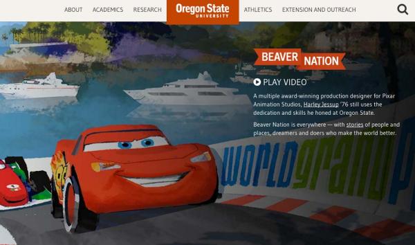
West Regional: Oregon State University

From the West Regional, our winner was number seven seeded underdog Oregon State University. The OSU website caught our attention for its focus on visual storytelling. From stories about current students, research programs, and famous alumni, the imagery is so potent that only a small amount of text, which is ideal for web content, is necessary. Storytelling is so important to OSU that they’ve dedicated a whole separate website to sharing the visually-rich tales of alumni changing the Pacific Northwest, the nation, and world. We also loved the section on Corvallis, the small city nestled in central Oregon that is home to OSU with its content-rich page devoted to reasons why a prospective student will love Corvallis, from its high ranking as a college town, to its proximity to Portland and the Oregon coast.
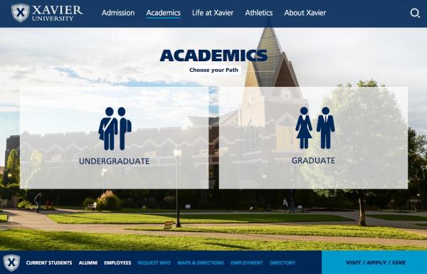
East Regional: Xavier University

Xavier University, the number two seed out of the East Regional, defeated Indiana’s website for a spot in our Final Four. Xavier’s site stood out first and foremost for its extensive use of iconography. The use of icons in web design has really exploded over the past few years and Xavier does an excellent job of employing them to both enhance usability and express some of what makes the university unique, such as its Jesuit heritage and focus on service. Search is another prominent feature of the site. Finding a specific program or major is often one of the first actions a prospective student will take when they get to a school’s website. The search box in the center of the homepage and again in the academics section makes answering “Do they have my major?” fast and painless. Finally, the photography paired with succinct copy provides a rich story about what Xavier will be like for a new student, giving prospects a glimpse into life on campus, in Cincinnati, and abroad.