How Your Higher Ed Website Is Failing At Recruiting Undergraduate Students
If your website is struggling to deliver a good experience for prospective students, it could be that you're doing these things wrong.
The recent announcement that Sweet Briar College will be closing its doors at the end of the academic year has some experts heralding the start of a trend for higher education institutions with dwindling enrollment numbers. While unfortunate, this contraction in the number of small, private colleges and universities across the country is not unexpected. For some, closing is the only option, but for others, it’s not too late to get smarter when it comes to digital marketing strategies.
By understanding today’s prospective undergraduate students, higher education marketers can craft smart strategies that successfully communicate to prospects. A recent Eduventures study found a college’s website to be the second most useful information source for non-enrolled students looking to learn about an institution, only after college comparison websites. With so many prospective students relying on college and university websites as a significant part of their decision making process, higher ed marketers need to run — don’t walk — to address their website shortfalls.
Seeing Is Believing
These days, prospective students are discerning customers – they’re more sophisticated than previous generations when it comes to garnering information from photos on your college website. For instance, they look at not only the style of clothing students in pictures on the website are wearing, but also the brand to make determinations about the student body and school. And if you’re showing food served in the dining halls, you’d better make sure it looks delicious because your prospects have a keen eye for cuisine.
If you want to ensure that your website is putting its best photographic foot forward for prospective students, you’ll need to invest in great photography that, despite being carefully curated, communicates an authentic campus experience. Keep in mind, imagery illustrating the student experience should be used throughout the website on all high-traffic pages, not just the “About Us” page. By combining data from your site analytics and conducting a content audit, you should be able to identify which pages on your site require photography.
Walk This Way
While nothing is as valuable a recruitment tool as a campus visit, online tours can be an effective way to show your school off to prospective students. We’ve found that video tours and photo album tours are equally good, however regardless of the medium you select, there are some key features that are must haves.
Hotspots
If you’re including a map as part of your online tour, don’t forget to call out hotspots across campus. Highlight specific parts of campus life that prospective students would consider integral to their college experience while showing important places on campus:
-
Student centers are full of great amenities, some of which are a big draw for prospective students, so make sure you call out the unique ones your school offers.
-
While showcasing athletic grounds, highlight the intramural sports that use them.
-
When you’re calling out dormitory buildings, show individual rooms in which freshman can expect to be placed.
-
If your campus is located in a thriving college town with lots of local attractions, make sure you call out all the cool things to do off-campus.
Navigation
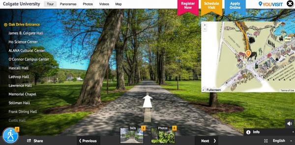
An online tour is only as good as a visitor’s ability to navigate it, right? That’s why yours should include two ways to get around. First, users should be able to click on a landmark on your map in order to access information about that point. Second, your map should also include a navigation key on the side that lets users click on the name of a landmark to access the related information. Here’s a great example of an online campus tour done right so far as navigation is concerned, but as you’re making your way around campus, you may notice they could have included more of the next key feature.

People
Make sure your online campus tour shows off one of the most important parts of your school – your community. Prospective students don’t want to see empty scenes of your campus, so avoid looking like a ghost town and include students in your tour.
To Serif or Not To Serif
One thing you might be surprised to find out is important to prospective students checking out your website is the font you’re using. Believe it or not, your site visitors associate the font you use with a level of prestige for the university — so much in fact that your font should be incorporated into your user-testing plan to make sure it is sending the right message. Your font is ultimately part of your school’s overall brand identity, so you’ll want to make sure it resonates with your prospective students.
Rah, Rah, No!
Sometimes you luck out and your school colors look great on your website, and then there are those school colors that were most definitely put together long before websites were a thing. Truth is, there are some color combinations that are tough on the screen and end up falling flat during user testing. If you happen to be in that camp, don’t despair. Just remember the user experience comes first and find a way to use your colors to your advantage. By incorporating them strategically and perhaps sparingly, you’ll remain in line with your brand identity while balancing the goal of an inviting and attractive website.