New Logo Celebrates OHO’s 25th Anniversary
We’re excited to reveal our new logo and identity to celebrate OHO’s 25th anniversary. The new logo returns to and reinvigorates the design elements of the original logo, and it more succinctly reflects our agency culture and the focus of our work – driving impact through effective partnerships.
“I love that the new logo merges our original typographic logo with new, nuanced meaning,” said Jason Smith, OHO Founder. “The ‘ripples’ reflect the impact we are producing for our clients and also the impact that the company has on the lives of our team. OHO exists to be ‘a great place to work, to allow our team to do rewarding work, and to enable people to live the lives they want’ – and I believe that the new logo captures the essence of this impact and partnership - both internally and externally.”
The original OHO logo was launched with custom Timbuk2 messenger bags.
As an important part of our company and brand evolution, we’ve removed “Interactive” from our logo and name that we've used since 2008. This change is another return to the original design, and it reflects both the common usage and OHO's expanding strategic services outside of the strictly digital space.
A Year-Long Process
We applied our identity development process to redesign and evolve the logo. Director of Design and UX, Jordan Clayton, and his team began by conducting market research, landscape analysis, and internal branding workshops. From this foundational work they developed key design criteria that served as guideposts for our creative process.
Through an iterative process, the team explored many possible avenues in pursuit of a logo that could stand out in the market and represent our work. They reflected on OHO's past 25 years of branding and logo permutations and cultural elements – such as our unofficial penguin mascot “Pengie” – to understand where we came from and what would make sense to carry forward.
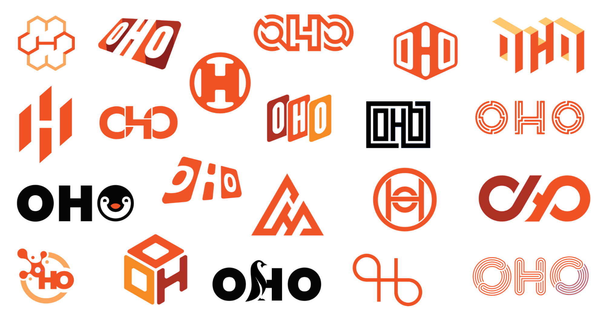
The team explored wide reaching directions; some that leaned more tech-friendly, some more sporty, some that were more sophisticated in nature, and some that even incorporated our penguin mascot. The team also applied various logos to different media executions to more accurately evaluate how they’d look in real life.
“This process was just as much figuring out what didn’t work as figuring out what did work,” said Jordan. “Once we were able to eliminate the various conceptual directions that didn’t work well, we began to see a clearer path forward to success.” The final direction emerged from this process and fittingly and emphatically expressed what OHO represents as an organization – driving impact through effective partnerships.

“The final iteration is a strong, clean, dynamic, and balanced mark that captures four key elements,” Jordan reflected. These key brand elements include:
- Ripples of Impact – the repetitive line motifs capture our focus on ensuring that our work is beautiful, clear, easy to use, and achieves the client’s goals
- Connection – the “binding” on the center of the "H" represents that we forge strong partnerships and pull everyone together with our team, clients, and partners.
- Versatility – the new logo works in vertical and horizontal orientations and accommodates a flexible color palette capturing our multifaceted and flexible approach that adapts to client needs.
- Simplify the Complex – in our client work, we tackle complex communication challenges and develop a strategy that is streamlined, nuanced, and reflects the context and history of our clients’ brands. The new logo captures this unique element of our process – calling back to our origins, yet finding a fresh, nuanced, and impactful representation of our current and future work.
The entire process was spearheaded by Jordan along with members of our design and marketing team including Geoff Sanford, Lisa Calderon, Eric Grzymkowski, and Jennifer Wood.
Looking Forward
“I’d like to thank Jordan, Geoff and the team for the outstanding process,” said Jason Smith. “I love the work and the outcome. I’m excited to see how the logo will inspire and push the evolution of the OHO brand expression. Thank you!”