New Responsive Website Launch: The University of Scranton
As we roll toward the start of another academic year, the competitive landscape in higher education continues its shift.
Reaching prospective students in a meaningful way has never been so important. Institutions that embrace the changing environment are setting themselves up for success while those that stick with the status quo may not fare so well. One institution getting out ahead is The University of Scranton. They identified the opportunity to lead the pack by providing an engrossing digital experience that communicates the benefits of their tight-knit community and overall student experience.
After a $260 million investment in facilities and faculty, The University of Scranton wanted to capitalize on the momentum created and effectively communicate their unique story. They wanted a new website that would:
-
Reflect their community values
-
Speak to their specific audience
-
Help to increase campus visits and, in-turn, enrollments
-
Use a responsive design
-
Be managed through a common CMS
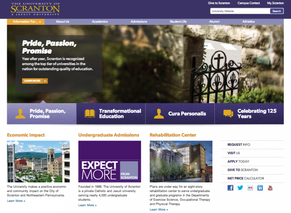
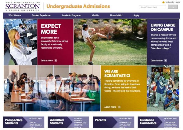
We worked with The University to retrofit their existing site structure into a new creative design. In addition to the main site, we built a new undergraduate admissions site from scratch. Both sites utilize a responsive design and were built in Hannon Hill Cascade to facilitate easy and quick content management.
New The University of Scranton Website

Before we started creating the new undergraduate admissions site, we worked with The University to conduct research into their prospective students. We wanted to understand the motivating factors for this group in order to design and build a website experience that would drive a prospect to schedule a campus visit. In addition, our research provided insight into how best to feature the unique aspects of the curriculum and The University’s religious mission and ministry.
New Undergraduate Admissions Site

Responsive Design
The team at The University of Scranton was especially excited to leverage our depth of experience in responsive design to create a site that communicated their message effectively on any size device. We worked together to determine break points that made sense for the site content and incorporated other best practices.
Content Strategy
To share the student experience in a compelling, authentic narrative that reflects their community, The University incorporated beautiful photography of their people and campus throughout the websites. Their use of visual storytelling allows site visitors to connect on a personal level. In addition to great photography, The University incorporated lots of micro-content to communicate interesting facts and data that help to educate prospective students and their parents.
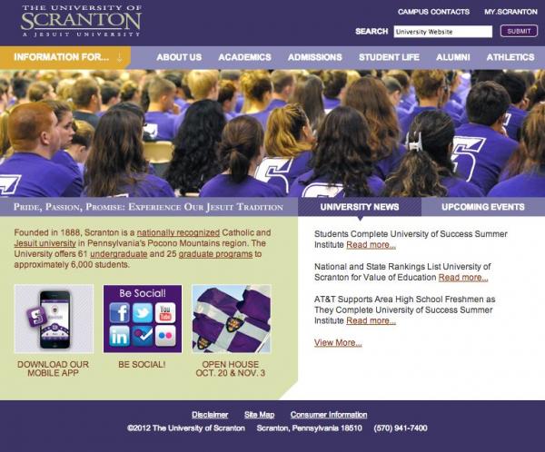
Previous The University of Scranton Website
