What Google's New College Search Feature Means for Your Higher Ed Website
Recent changes to the way Google presents higher education search results forces us to rethink the prospective student journey and the role of the homepage and key informational pages.
Google recently announced a new feature that will significantly impact the user journeys of your website visitors. And with 49% of higher education website traffic coming from organic search this new feature may disrupt what we know to be our prospective student journeys.
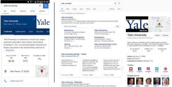
Google has created a college-version of its preview pane. Upon searching for the name of a college or university, the preview pane now displays important information that prospective students look for when researching colleges. Using a blend of publicly available data, third-party website data, and content stripped from the institution’s digital properties, Google creates a “one-stop shop” experience for prospective students who are often in the early stages in the college application process.
This feature is most distinctly noticed on mobile, even leveraging the university’s primary brand color (a nice touch!), and on desktop it is located in the traditional preview pane location (to the right of search results).

Here are 8 things to think about when evaluating the impact of this new feature on your college or university’s website.
1. This new feature disrupts the prospective student journey
Now, the majority of your brand-aware website visitors (i.e. those who have passed the awareness phase) will get to your homepage through two avenues — direct (typing in the URL) or after they’ve viewed the Google preview pane. However, prospective students who are further down the funnel will continue to search for branded queries like “[college name] tuition” or “[college name] mba.” Consider the experience of these visitors as their first page on your website is beyond both the preview pane and the homepage. How are your templates for these critical pages structured with these visitors in mind? In a convergence of marketing strategy and UX design, we should observe how our visitors’ behaviors shift over time.

2. Your higher ed website may see a relative dip in organic traffic moving forward
Upon a search using broad brand terms (i.e. “ucla” “yale” “spelman college”), Google is offering immediate answers to the most common, transactional questions upon landing on the top of first SERP page — without even needing to visit the institution’s website. Questions like “Will I get in?” and “Can I afford it?” are answered through quantitative info like acceptance rate and average cost after aid. Be sure to add an annotation to your Google Analytics profile data, and be prepared to do some number crunching when comparing your organic search traffic year-over-year.
3. The new feature only applies to undergraduate four-year U.S. colleges
What does this mean for graduate, continuing ed, or non-traditional offerings? Remember that Google search queries for these programs tend to be program specific (including degree specific terms, or specific courses of study), so focusing your attention on a strong blend of organic search health plus PPC support will help get these visitors to the content they need when they need it.
4. PPC campaigns will still appear ABOVE the search feature
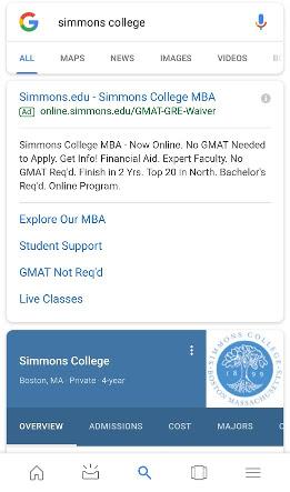
Google continues to support one of its most profitable revenue streams by placing branded paid search campaigns above the search feature. Running branded paid search campaigns may still be a key part of your strategy, particularly if you’re competing with other institutions or businesses with similar names. On desktop, the PPC ads appear at the top of the SERP and the preview pane continues to appear to the right of the page.

5. Speaking of…what about colleges with the same name?
Based on our tests so far, the resulting institution for the preview pane will be geographically closer to the searcher’s location. This may pose a problem for universities that have significant outreach beyond their local regions. Implementing an always-on branded PPC strategy in key target regions may help address this brand confusion.
6. Information is pulled from publicly reported data
The data displayed in the preview pane is pulled from the U.S. Department of Education’s College Scorecard and Integrated Postsecondary Education Data System (IPEDS), a comprehensive data set for 4-year colleges.
Good news? The data is pulled from a reliable source rather than outdated data on your website or publication sites.
Bad news? This data is provided without the context that your website works so hard to communicate.
However, keep the prospective student journey in mind. The likely next step for these visitors will be a deeper search query that takes them to your website, to obtain a richer picture of the institution.
7. Aggregating third-party content: wikipedia, rankings, and more
In an enhanced version of the previous preview pane, the new college preview will continue to pull content from the institution’s Wikipedia page (college description, notable alumni) but will also pull information like rankings from publication sites. Review your Wikipedia page and update any outdated information, and keep an eye out on the rankings listed to understand what is being communicated to your prospective students.
8. Organic website content will continue to be highlighted
The preview pane will still highlight important assets that you DO own! Text content, photos, videos, etc. will be scraped from your website and displayed neatly in the tabs of the preview pane. Conducting regular SEO technical and content audits, reviewing the elements on your site that contribute to organic search health, and ensuring that new content is optimized for search will help you ensure that your owned content contributes to this new experience.