Driving Digital Transformation in Health Insurance
As a part of Blue Cross Blue Shield of Vermont's digital transformation, we worked with the marketing and IT teams to relaunch their brand on their website and create a comprehensive plan finder. Our goal: create a website that matched their outstanding customer service, increased membership, and supported retention.
- Healthcare
- Website Redesign
- User Research
Services
- Strategy
- User Research
- User Experience
- Visual Design
- Drupal Development
Bringing the Brand to Life
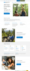
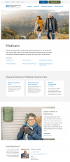
The new website design marries the strength of the Blue Cross Blue Shield brand with the design insights uncovered through user research. Users responded most positively to a clean design, light color treatment, and direct language.

Expanding the Visual Vocabulary
To emphasize the commitment to Vermont, we expanded the brand language to include custom illustrations that connected with the environment and offered a visual break from the gridded layout.
Improving the Mobile Experience – Screen-by-Screen
The site is fully responsive to provide the same functionality in an optimized mobile format. Our UX team focused on creating layout sections that can be viewed on one screen at a time to reduce scrolling and improve readability.
A Health Plan for — and From — Vermont
To separate itself from national insurers, the design emphasizes BCBSVT's commitment to its members and its commitment to Vermont. The site imagery includes authentic images of actual residents and reflects the local landscape – with a heavy emphasis on outdoor locations and lush, green landscapes.
Improving Plan Selection with User Research
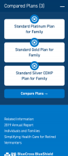
In the former website, plan information was shared through rudimentary webpages and detailed PDF files that needed to be downloaded. During the engagement, we tested peer health plan websites with prospective members to research the ideal plan finder tool. The resulting interface allows for easy selection and comparison, plus easy maintenance for the web team with plan data easily updated via data feeds. The goal of the interface is to allow members to self-serve and fully understand their options 100% online.

An Ever-Evolving Website
The Blue Cross Blue Shield site is built on Drupal 9 and set up to evolve as the organization expands its digital footprint with an enhanced Find a Doctor tool, content marketing strategy, and increased integration with Salesforce.


