A Hospital Website Designed for the Needs of Parents
After conducting user research, OHO worked closely with the Blythedale team to design a site experience that helps parents find information quickly and easily to make informed decisions about care for their children.
- Healthcare
- Website Redesign
- Content Strategy
- Digital Strategy
- User Research
Services
- Strategy
- User Experience
- Visual Design
- Drupal Development
- Ongoing Support

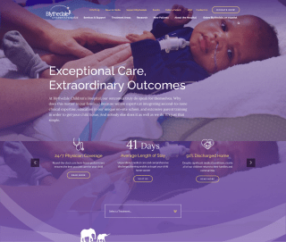
A Homepage Designed Around Decision Criteria
Blythedale Children's Hospital is a rehabilitation hospital that serves as a safe place for families and children to continue their recovery. Through our research, we learned that families considering Blythedale are moving from medical centers and typically less than a week to research, visit, and select a rehabilitation location for their child. The homepage of the site is designed around the user needs and the primary call to action — come visit.

Prioritizing Treatment Options
The site provides a direct pathway to treatment options.

Emphasizing Stories
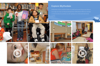
In talking to families, we saw that medically detailed stories — that highlight the success and outcomes — were a key way that the parents gathered information.

Showcasing Video
Parents in our focus groups responded very well to video. Establishing the high quality of care children at Blythedale receive was a high priority for the homepage.

Consistent CTAs
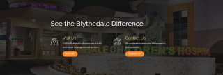
The call to action is to come visit on every page, and we are direct in letting people know that this is the best next step.
A Mobile First Approach
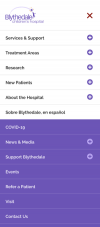
Over 60% of website visits are from mobile devices – an extremely high rate that is due to parents conducting research from their children's hospital rooms. It was essential that the website be streamlined and optimized first for mobile. The treatment pages are designed as hubs of information that pull all of the details about a treatment together. This reduces the users needing to learn the site structure.
Simplifying Site Navigation
In the previous site, research, services, and treatment areas all had similar items under each drop-down menu. This made it unclear which page was authoritative. By defining the “treatment areas” we collect all of this information in one location which increased user’s confidence in using and learning the site.

Streamlined Content Management with Drupal
To support the marketing team, the site is built on a create once, publish everywhere philosophy that is powered by Drupal taxonomy and Drupal views. The CMS supports the content publishing strategy and reduces the content maintenance efforts.


