A Holistic Approach to Digital Branding
This Pacific Northwest institution embodies the “whole person education” ideals of the Jesuit order, and our website redesign project with Seattle offered the opportunity to elevate their brand storytelling, celebrate their location, and showcase their faith identity. We partnered with their chosen CMS vendor Terminalfour on a smooth handoff.
- Higher Education
- Website Redesign
- Content Strategy
- Digital Strategy
Services
- User Experience
- Content Governance
- Visual Design
- Strategy
- Creative Concepts

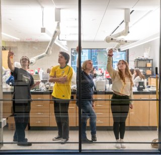
Reinforcing the Brand Through Consistency and Clarity
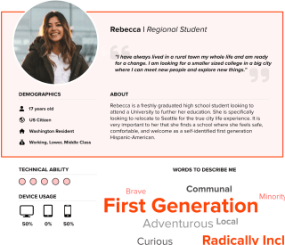
Dense text and lack of visual consistency across the old website diminished the university's brand strength. We grounded our work in the key user personas, exploring new ways to elevate the site's visual design language and elevate the Jesuit values while creating a clear, streamlined user experience.
Aligning the Site to Customer Needs
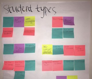
In a half-day persona workshop with the admissions and financial aid teams, we identified the major customer segments and brainstormed the relevant goals, needs, pain points, and influencers when thinking through the scenario of choosing and attending Seattle University.
Prioritizing Visual Brand Alignment
Our design process yielded a more unified design system to support the brand marketing and communications priorities of the site. We drew inspiration and direction from their brand guidelines and marketing collateral, as well as a review of the websites of cross-admits, competitors, and other inspirational sources.
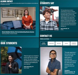
Telling the Seattle Story
A key project priority was to create a unified brand voice through which Seattle could tell its compelling story and convey its Jesuit values. We created a messaging architecture to guide the site content strategy and storytelling approach, supported by a comprehensive set of governance recommendations.
Program Discovery and Comparison
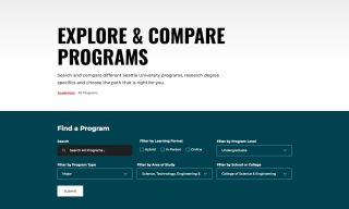
We developed a user-friendly program discovery interface that allows for comparison of up to 3 programs. Users can filter programs by level, format, program type, area of study, or school/college, in addition to searching by keyword.
Focused and Filtered
The comprehensive program taxonomy gives users the option of filtering by a range of key criteria including learning format, program level, program type, school or college, and area of study, in addition to the ability to search by keyword.
Clarifying Descriptions
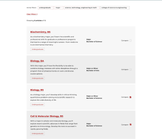
Program results are presented with the name, level, a brief description, and degree type. Descriptions can include keywords to support users employing the search function.
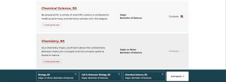
Compare and Contrast
Some academic programs may appear very similar at first glance. Our comparison feature allows site users to compare up to three programs head-to-head against key qualifying criteria.
Programs for the Whole Person
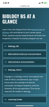
Our review of the previous site found program pages to be dense, confusing, and hard to parse, doing little to convey the life of the program. We created an engaging and inviting template for academic programs, in addition to providing guidance around stronger governance of program content.
