Engage and Enroll
Illinois Tech is Chicago’s premier technical institute. The university needed a site that would reposition the school, increase engagement, and drive enrollment. We achieved results by grounding our strategy in user research to imagine a new site that caters to the unique customer journey of their prospective students.
- Higher Education
- Website Redesign
- Content Strategy
- Digital Strategy
- User Research
Services
- User Research
- Strategy
- User Experience
- Visual Design
- Content Strategy
- Drupal Development


Research Sets the Strategy
By starting with a user research study, we identified the customer journey, prioritized needs, user attitudes, user behaviors, and research methods of prospective students. These insights informed the site structure and design and ensured that the new solution would lead to an increase in engagement and enrollment. Outputs of the research included customer journey maps, personas, key content needs, and photo and video preferences.
A/B Testing Creative Concepts
Throughout the design phase, we tested concepts to confirm and refine the design system and user experience strategy. We A/B tested two different prototypes to ensure the visuals resonated with prospective students.
Combining Brand + User Needs
Illinois Tech's three brand pillars — being the premiere tech-focused university in the Chicago area, providing students with unparalleled opportunity and value, and focusing on active learning through creation, invention, and problem-solving — formed the foundation for the site design and content strategy.
Introducing the Brand & Providing Quick Access to Academic Programs
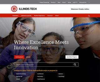
This top panel introduces the top-line institutional messages through the headline and video. The Illinois Tech prospect is highly academic and focused on the programs – therefore, our UX strategy was to provide quick access a full listing of academic programs.
Introducing the Brand Pillars
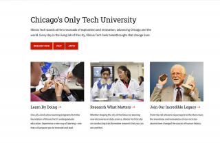
The three brand pillars of the messaging architecture are introduced and prospects are invited to explore each further.

The People Make the Place
Student, alumni and faculty profiles activate the brand pillars.

Bringing Active Learning to Life
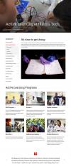
Illinois Tech students learn by doing, seeing, and feeling — prospective students want to see that represented in academic content throughout the site.

Elevating Research
Supporting student research is a cornerstone of the Illinois Tech student experience — for both graduate and undergraduate students — that the new site needed to highlight.

Showcasing Student Life
While academics are the primary motivator for prospective students, student life is still an important differentiator the site needs to highlight. Rich photography capturing the vibrant city life is pervasive on the site and provides a sense of place for prospective students. Student-focused videography is also featured prominently.
One University. One Design.
Illinois Tech is incredibly complex – 8 colleges, 4 institutes, and more than 400 academic programs. To elevate the prestige and professionalism of the university, a goal of the redesign was to create a single design system that would present a single identify while offering flexibility to meet the individual needs of each organization.
Efficient Content Management with Drupal
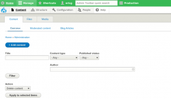
Using Drupal, Illinois Tech centralized new, event, story and program publishing and used a tagging structure to push content across all of the web properties. With this implementation, content silos are knocked down and each piece of content can be reused at relevant points across the site.

Results
I highly recommend OHO. They led a complete rethinking of our website. Working with our extraordinarily talented web team, OHO helped us dramatically increase our presence and powerfully tell our story. OHO set a new standard for strategy and design.


