A Transformative Website for a Transformative University
The University of Mississippi partnered with OHO on a comprehensive website initiative with multiple objectives — bringing a new brand identity to life, implementing a sustainable content strategy, revamping site architecture, implementing Cascade CMS, and reining in highly decentralized website governance.
- Higher Education
- Website Redesign
- Content Strategy
- Digital Strategy
- User Research
Services
- Strategy
- User Research
- Content Strategy
- Visual Design
- Content Governance
- Cascade CMS Development


Design Driven by Research
Building upon research already conducted by the university, we surveyed more than a thousand members of the Ole Miss community and ran ethnographic interviews with nearly two dozen, helping surface key user needs and develop personas and customer journeys to inform site flow and priorities.
Evolving and Elevating an Iconic University Brand
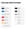
The expansive design discovery sought to identify the key elements of the Ole Miss brand and lived experience. A fresh take on the typography, color palette, and design components capture the spirit of a school transformed and transforming. We created templates and components that offer content editors to flexibly meet a wide range of communications needs while providing a consistent and effective user experience that amplifies the brand.
Capturing a Diversity of Ole Miss Student Experiences
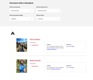
Nobody can describe what it's like to go to a university better than its students. We created a student ambassadors feature that enables prospective students to reach out directly to students who share their interest or hometown and features those answers across the site.
Communicating the Value and Cost of an Ole Miss Education
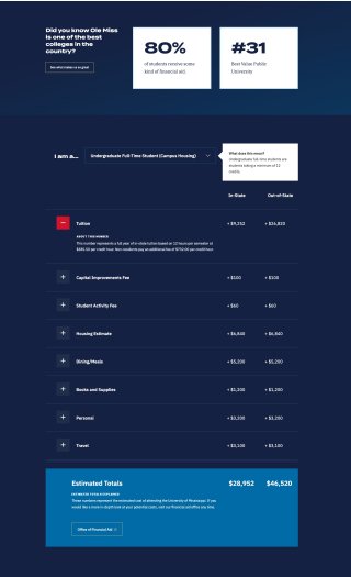
For a large university like Ole Miss, there are a range of cost factors to consider — in-state or out-of-state, program choice, on-campus or off-campus — and it can get confusing fast. Our design solution allows students and families to review the costs relevant only to them. The fees are cleanly broken out by type and rolled up into a single tuition and cost estimate.
Affordability Matters
By pairing tuition details with stats that convey the affordability of an Ole Miss education, families can see how the university is within reach.

Validating the Approach
We conducted comprehensive user testing of our design concepts, spanning multiple segments and demographics, to gauge how effective and meaningful they were for the passionate Ole Miss community. Our approach included word associations, heat mapping, evaluating each concept against a defined set of criteria, direct comparison between each design concept.
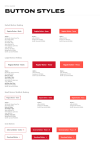
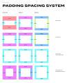
A Comprehensive Digital Design System and Style Guide
As Ole Miss looks to apply the design system across hundreds of university sites, our documentation helps ensure the extensibility of the design over time.
Streamlining University Wide Governance
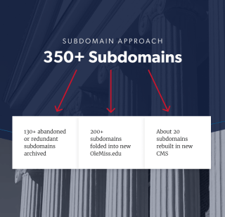
The 350+ subdomains that comprised olemiss.edu yielded a highly fractured user experience. We revamped site architecture, mapped out a plan for migrating subdomains to the new Cascade CMS, and created comprehensive site governance recommendations with a plan for rollout, training, and implementation.
Centralizing on Cascade CMS
As Ole Miss shifted away from a complex digital ecosystem housed on multiple WordPress instances, we delivered them a new website built in Hannon Hill's Cascade CMS that better aligned to their needs for publishing, governance, and personalization.


