
Higher Education Video Best Practices
How long should your videos be? Should you shoot them vertically or horizontally? Where should you post them? We’ve pulled from more than 10 years of higher education research to answer all your higher education video questions.
Simply put – the best video is the one that produces the best results. It can break a host of rules and still be insanely effective. However, a few guidelines will help you improve your odds at success.
Optimal Length of Higher Ed Videos
To a great extent, a prospective college student will watch an entire video — no matter the length — if it is compelling and provides all the information
the viewer needs. However, there are a few higher ed industry standards that will help you create videos that match viewer habits:
- 70% of viewers will watch a video less than 1 minute
- Across the industry 55% of videos are less than 2 Minutes
- Fewer than 20% will finish a video that is longer than 10 minutes
These are good baseline measurements. However, different college video formats have slightly different optimal length times based on what time of viewers they have been created for and where they view them. And just because a viewer does not reach the end of a video does not mean it hasn’t had an impact.
Optimizing Your Videos for YouTube
If you use YouTube as your video service, you are not done once you upload your video and sync your subtitles. You should take advantage of all the marketing tools YouTube offers. Here are a few approaches you should consider:
- Customize Your Thumbnails: Do not rely on YouTube to choose your video thumbnail (the default reference image that will be presented on most social and website posts). You will want to choose an image that best conveys the video and upload a customized thumbnail.
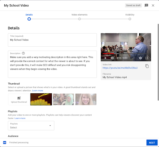
- Effective Summaries & Keyword Tags: Many higher ed video summaries fail to convey key search terms and the marketing messages within the video. These are important tools to help SEO and they will appear in search returns as well as summaries posted to social media. Don’t forget to add keyword tags when you upload your videos as well. Descriptions do a lot of heavy lifting when it comes to maximizing SEO and providing context on YouTube as well as on your social media posts
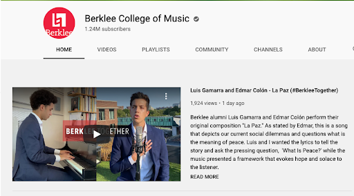
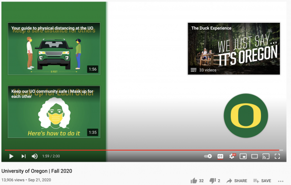
Cards & Watermark: Cards that appear during the video help keep the viewer engaged. Options include providing links to other videos, playlists, YouTube channels, and websites. If you do use cards during the video, use them sparingly so you don’t distract from the video’s message. Don’t forget to add your school’s brand as a watermark. This will appear on the lower right corner of your videos.
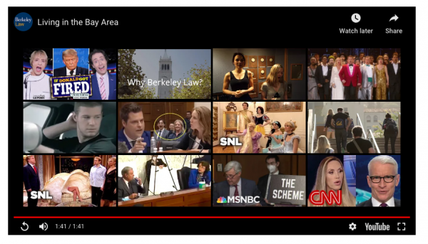
- End Screens: Add end screens at the end of your videos to provide quick and easy links to related videos. If you use end screens you will need to add 5 to 15 seconds of neutral footage to the end of your video to accommodate end screen panels. There are a number of templates available that will accommodate up to four video links.
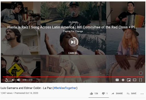
- Avoiding Ads: Don’t forget to set the rel parameter to 0 when you embed your video to ensure that the next recommended video will be within your channel. If you don’t take this step, YouTube will serve up a set of ads. You do not want your viewers to see a link to a competitor video on this screen.
Other Videos Hosting Options
While YouTube is the most popular hosting service for higher education organizations, two other options are also popular: Wistia and Vimeo. With different service, fees, and advertising provisions, deciding which service is best for your organization can be daunting.
Bonjoro — a video marketing service platform — has published an excellent summary of the benefits and deficiencies of each of these video hosting services.
Landing Page & Email Best Practices
Including video on emails and landing pages is often overlooked by higher education organizations. This is a missed opportunity, as including video on landing pages can increase conversion rates by 80%.
Some other best practices you should keep in mind:
- Above the Fold: Place the video above the “fold” of the website to encourage views.
- “Video” in Subject Line: Include the word “video’ in the emails subject line and your open rates will improve.
- One-Third Bounce After 30 Seconds: Consider trimming your video down to no more than 30 seconds.
- Below 60 seconds: Maximum landing page video length should not exceed 60 seconds.
Best Practices for Facebook Videos
There are a few tricks to formatting and posting videos on Facebook. Here are a few helpful guidelines:
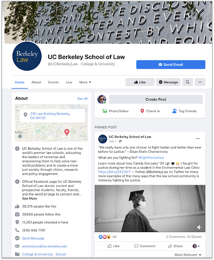
- Be Brief! Facebook videos perform best when they are between 30-90 seconds long.
- Delay Narration: Because Facebook plays videos automatically in silent mode until the user clicks to access the sound, include a buffer at the top of your video and delay the narration by a few seconds. This will give users a chance to click for audio and they will not miss anything.
- On-screen Text Support: On screen text is more important on Facebook because in all likelihood, users will not click the audio to hear the spoken words. Judicious use of graphic text will help convey your messages.
- Direct Upload: If you upload your video to Facebook directly instead of reposting from another service (such as YouTube) Facebook will prioritize your video and it will have a greater chance of being exposed to more viewers.
Portrait vs. Landscape Videos
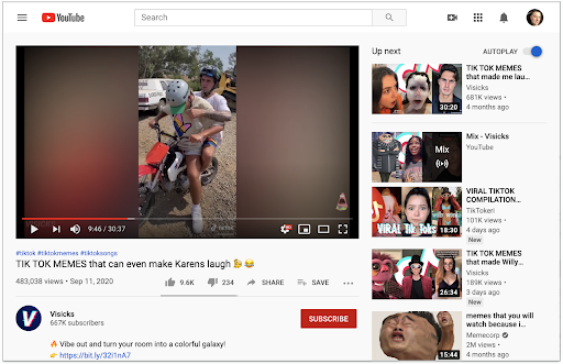
Long considered taboo by people who specialize in video production, vertical video formats are gaining traction — particularly on platforms like Instagram and TikTok. Breadnbeyond’s article “The Ultimate Guide to Vertical Videos for Marketing” makes a compelling case for shooting video in a portrait mode. Here are a few statistics that bolster their argument:
- 57% of video worldwide plays on mobile devices (smartphones and tablets.)
- 94% of the time mobile users hold their phones vertically
- Vertical video viewers have 90% higher completion rates than horizontal views
- Less than 30% of users turn their phones to watch a video
- 52% of global traffic is mobile (Q2, 2018)
Mobile vs. Desktop Viewing Habits
Clearly if you are using your phone with an application that is optimized for vertical viewing, portrait video display is better.
However, that doesn’t mean it’s time to completely shift focus from horizontal video.
- Prospective Students Use All Types: Prospective students use desktop, laptop, and mobile devices when they view college websites.
- Fewer Use Mobile to Research: Less than 10% say that they only use mobile devices when they view college websites. These users tend to be from economically disadvantaged backgrounds who do not have ready access to computers.
- Desktop for Research: Of the 90% who use a combination, the majority use computers when they are doing in-depth research about their college options. This includes viewing videos on college websites.
- Mobile for Social: Prospective students are more likely to use their mobile devices to view social media.
OHO Recommendations for Higher Education Videos
Prospective students use a mix of devices when researching schools, so it’s important that you plan for both horizontal and vertical videos — depending on where and how each video is being presented. Desktop does make up the majority of higher education website traffic, but mobile has been steadily increasing over the last 6 years.
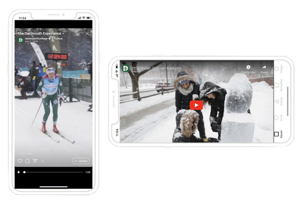
Design Approaches to the Rescue
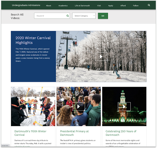
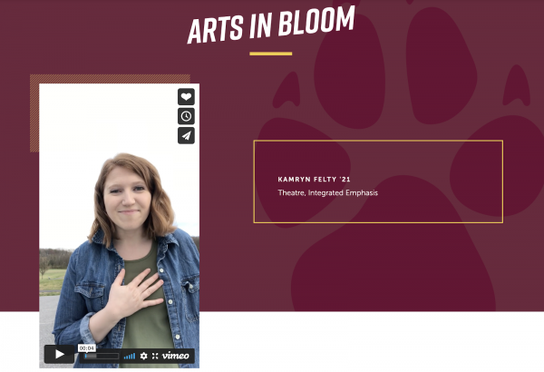
If you find yourself with a plethora of student-produced vertical videos — or if you wish to produce videos specifically for platforms that favor vertical videos — there are a few design approaches you can use that will help you optimize their presentation on your website. Here are a few examples that present vertical video without the awkward gray columns on either side of the video.

Text on Video
When you wish to incorporate text on your videos, there are a few guidelines you should follow. It’s important to distinguish between onscreen text that supports your video’s messaging and captions that allow hearing impaired viewers to understand the spoken audio.
Captions / Subtitles
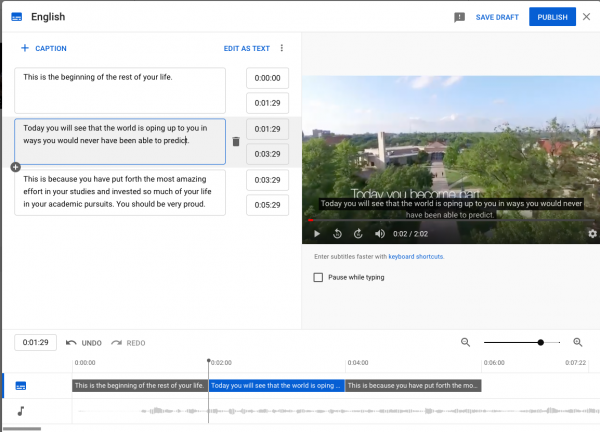
To ensure your website meets accessibility standards, all of your videos should provide the option to view video transcript captions. If you post your videos to YouTube this is a relatively straightforward process.
YouTube provides an automatic captioning feature. To access it:
- Upload your video
- Click edit and subtitles
-
Choose the language you would like to use and click the ADD button underneath the Subtitles column head. It will give you three options:
- Upload a transcript
- Manually type the script
- Automatically generate and sync the script.
The auto captioning feature will save you time — when it works. But you must make sure to proofread the YouTube generated subtitles before you publish. The auto sync feature is temperamental and will not work if there is a long preamble before the narration begins or if the video has a loud background soundtrack.
You can also upload different language translations for your subtitles. The auto upload and sync feature is not available for non-English audio.
If you have difficulty using the auto sync feature on YouTube and you don’t have the time to enter and tag your subtitles, IBM’s Watson, and online services provided by Amara, and Descript offer excellent alternatives.
Graphic Text Overlays
Text overlays are an effective way to emphasize the messages your video conveys. But they can be problematic if not used appropriately. If you follow guidelines that govern color, size, position, and duration, you should be set. Typito offers the following advice:
- Color: Always ensure that your type color contrasts enough with the background to be legible. If this cannot be accomplished, use a slightly transparent backing panel with an opacity of 0.7 to 0.8.

Right = much more legible
- Size: The bigger the better — at least 3 times bigger than your subtitle point size. This will necessitate brevity. Text is meant to support and emphasize. It must be pithy.
- Position: Do not position your graphic text near the bottom of the video. Many video players include their controls on translucent bars at the bottom of the screen. You must also ensure that your type treatments do not interfere with your subtitles.
- Duration: A good rule of thumb is to ensure that every graphic text element stays on the screen at least two seconds longer than it takes the average viewer to read them. If these text elements are synced closely to fast-paced video, this rule may have to be discarded to keep up.
Completion Rates Do Not Equate Success
Do not feel that if viewers fail to view the entire video that it is not successful. Incomplete views of a video does not necessarily equate to dissatisfaction. Many viewers quit the video once they “get it” — meaning they figure out what will follow. This does not mean they don’t like the video — they may, in fact, love it.
Perceptions of Quality
Evaluations of quality are not always obvious. Viewer regard for video “Quality” is not necessarily based on high professional standards of script, production design, and videography. Heroes, brand anthems, and advertisements need to be of a high video quality to be impactful. However, they must not be seen as overly slick or “markety.” Gen Z prospects especially do not trust slick, gimmicky, hard-sell approaches.
Prospective student viewers do not hold the other video types to such rigid standards. Day in the life videos can be pretty ragged and still be effective. In fact, they are seen as more authentic. You also don’t need expensive equipment to pull off most of the video formats. An iPhone with the latest camera and a cheap ring light can provide amazing results.
Do What Works for You
The guidelines above are basic best practices that you may find useful as you create the marketing materials you need to promote your school. However, feel free to experiment with your own approaches and see how they fly. A right video is one that reaches the right people with the right message in the right place at the right time.